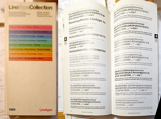
Up until the early 1990s, books like the one shown above were commonly used in typesetting. The (long gone) agency where I obtained this book had several operators. They’d type rapidly on green-screen terminals, inputting both the text and the formatting codes to change the font, its size, its weight, and many other factors.
The code would be run on a machine such as a Linotronic 300, exposed on photo-sensitive paper, then developed in a large beast of machine. To enter the processor room, you’d go through a darkroom door; then in the mist of processor chemicals that permeated the air, you’d feel, in the dark, for the tail of paper sticking out, and feed it into the churning maw of the processor’s intake rollers.
Once the rollers grasped the paper, you’d set the paper cassette in a tray, and go out through the doors and to the other end of the processor, once again in the light. Eventually, the paper would emerge, fully dry and ready to be waxed, then burnished into the layout.
The layout would eventually be photographed on a repro camera; then photographs or other art would be “stripped” in; that is to say, they were collaged, to use a term most artists understand; and then the film sandwich would be exposed on another piece of film, and eventually on a printing plate, for offset reproduction. As you can see, this process was rather involved, with many steps requiring different skills. But today, these functions are all combined in our layout and image manipulation software.
This Linotype book, from 1989, asks the bemusing question, “Are 2000 typefaces enough?” Besides turning the question around, to note individual qualities in a world of quantity, with a clever quote by Adrian Frutiger, likening type varieties to wine, one must note that 2,000 seems a rather quaint quantity today. One can easily amass a much larger question, with many new fonts coming at an ever-increasing pace.

